
Web Accessibility Implementation for Neurodiverse Users: Building a Truly Inclusive Digital World
Think about the last website that felt effortless to use. The information was exactly where you expected it. The colors were pleasant, the text easy to read, and you completed your task without a second thought. For many neurodiverse users, that experience is the exception, not the rule.
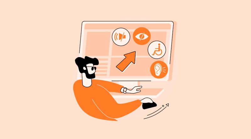
Web accessibility has, for a long time, focused heavily on physical and sensory disabilities—which is crucial, of course. But neurodiversity—encompassing ADHD, autism, dyslexia, dyspraxia, and more—represents a vast spectrum of cognitive processing styles. Implementing accessibility for these users isn’t just about compliance; it’s about cognitive empathy. It’s about building digital spaces that don’t just work for one type of brain, but for many.
What Does Neurodiversity Mean for Web Design?
First, let’s clear something up. Neurodiversity isn’t a deficit. It’s a difference in how the brain is wired. And these differences create unique user experiences online. Someone with ADHD might struggle with distracting animations or cluttered layouts. An autistic user might find unexpected auto-playing videos or ambiguous icons deeply distressing. A dyslexic user might hit a wall with dense, justified paragraphs in a fancy font.
The goal of neurodiverse-friendly web accessibility implementation isn’t to create a one-size-fits-all solution. Honestly, it’s the opposite. It’s about providing options, flexibility, and clarity so each user can shape their own experience.
Core Principles for a Neuroinclusive Website
Okay, so where do you start? Here’s the deal: it’s less about a checklist and more about a mindset. But these principles are your foundation.
1. Predictability and Consistency
For many neurodiverse users, an unpredictable website is an anxious one. Navigation should be logical and consistent across every page. Buttons that perform the same action should look the same. Links should be clearly identifiable. If a menu is at the top on the homepage, it shouldn’t jump to the side on a product page. This reduces cognitive load—the mental effort needed to process information—and makes the whole experience feel safer.
2. Clarity and Simplicity
Cut the jargon. Be direct. Use plain language and break complex ideas into digestible chunks. This is a huge part of accessible content for cognitive disabilities. Headings should actually describe what’s coming next. Instructions should be step-by-step. And for goodness sake, label your form fields clearly. “Contact info” is vague. “Your email address” is clear.
3. User Control and Flexibility
This might be the most important principle. Give users the reins. Can they pause animations? Adjust the contrast? Increase text spacing or change the font? A simple accessibility widget that allows for these customizations isn’t a nice-to-have anymore; it’s a cornerstone of modern web accessibility implementation. Let people interact with your site in the way that works for their brain.
Practical Implementation Strategies You Can Use Now
Alright, principles are great. But let’s get tactical. How do you bake this into your site?
| Focus Area | Common Barriers | Neuroinclusive Solutions |
| Content & Readability | Walls of text, complex sentences, lack of visual hierarchy. | Use short paragraphs, bullet points, and clear subheadings (H2, H3). Offer a “read-aloud” function. Allow font and spacing customization. |
| Layout & Navigation | Cluttered pages, too many options, inconsistent menus. | Embrace white space. Use a clear visual hierarchy. Provide a sitemap and breadcrumb trails. Keep primary navigation simple. |
| Multimedia & Interactivity | Auto-playing media, flashing content, non-skippable animations. | Never auto-play video/audio. Provide clear play/pause controls. Use static alternatives for animations. Respect “prefers-reduced-motion” CSS setting. |
| Forms & Tasks | Unclear error messages, timeouts, multi-step processes without progress indication. | Provide specific, helpful error messages. Avoid time limits, or warn users and allow extensions. Show a progress bar for multi-page forms. |
See, it’s not about rebuilding your entire site overnight. It’s about intentional tweaks. For instance, that “prefers-reduced-motion” media query is a single line of code that can make your site instantly safer for users with vestibular disorders or ADHD. It’s a low-effort, high-impact win.
Beyond Code: The Human Element of Testing
You can follow every technical guideline and still miss the mark. Why? Because you’re not testing with neurodiverse users. Automated checkers catch maybe 30% of accessibility issues—they can’t tell you if a workflow is cognitively overwhelming.
Involve neurodiverse individuals in your user testing. Listen to their feedback about what feels confusing, stressful, or illogical. Their insights are pure gold—they reveal the practical, human gaps that pure technical compliance misses. This is how you move from a website that’s technically accessible to one that is genuinely usable and welcoming.
The Ripple Effect of Getting It Right
Here’s a thought: the features that make a site better for neurodiverse users often make it better for everyone. Clear navigation? Everyone loves that. Readable content? Yes, please. Less clutter and distraction? That’s just good design. This is the core of the “curb-cut effect”—designs for specific needs end up benefiting the broader population.
By prioritizing cognitive accessibility, you’re not just checking a box. You’re building a more resilient, intuitive, and humane digital product. You’re acknowledging that human brains are diverse, beautiful, and all deserve a seamless online experience. And in a world saturated with digital noise, that kind of thoughtful clarity isn’t just accessible—it’s exceptional.